Turn your newsletter Thank You page into a silent sales machine
You did it. People are actually subscribing to your newsletter. That feels great.
But before you celebrate too hard, ask yourself: what happens right after they sign up? If the answer is a generic "Thanks for subscribing!" page with nothing else on it, you're leaving money on the table.
With a few simple tweaks, you can turn that bland Thank You page into something that welcomes subscribers, builds trust, and (hopefully) turns them into paying customers.
I've got a handful of tips below for making your post-sign-up page actually work for you.
4 elements of a great Thank You page
A good Thank You page does a few things at once: it sets clear expectations, nudges subscribers toward your welcome email, and drives awareness of your products or services.
Here's how I think about each one.
1. Remind them about the lead magnet
If you're using a lead magnet to attract subscribers (and you should be), the Thank You page is where you get them excited about it. Remind them of the value they're about to receive. Give them a quick description of what it is, how it'll help them, and what they can expect to learn or achieve from it.
Most importantly, give them clear instructions on how to access it. That could be a download button, a link to a private page, or just a message letting them know it's hitting their inbox shortly.
2. Set clear expectations about your newsletter
This one's underrated. Your Thank You page should remind subscribers what kind of content they'll get, how often you send (daily, weekly, monthly), and what the focus of your newsletter is.
It builds trust right from the start. They'll know exactly what they signed up for on day one, and that goes a long way.
3. Point subscribers to your welcome email
Email delivery matters more than most people realize. It doesn't matter how good your content is if it's stuck in Promotions or Spam.
Use your Thank You page to encourage new subscribers to go check their inbox for your welcome email. It's a small ask, but it makes a big difference. When they open and engage with that first email, they're telling their email provider that they actually want to hear from you. That helps with delivery for every email after.
4. Offer a substantial product discount
So at this point, we've reminded them about the lead magnet, set expectations, and taken steps to avoid inbox jail. Now comes my favorite part: selling something.
Think about where the subscriber is mentally right now. They just signed up. They're excited. The vibes are high. It's the perfect moment to present them with a great price on a flagship product or service.
To do this well, your Thank You page needs a few things. You want a headline that grabs attention and communicates the benefit of your offer (something like "Exclusive Offer: Get 50% Off Our Game-Changing Course!"). You want strong visuals, whether that's a mockup of your eBook, a screenshot of your course dashboard, or a video testimonial. You want to highlight the key benefits of what you're selling and how it helps them. You want social proof, like testimonials, case studies, or social media reviews from happy customers. And you want a call-to-action that creates urgency, whether that's a limited-time offer or a countdown timer with action-oriented language like "Claim Your Discount Now!"
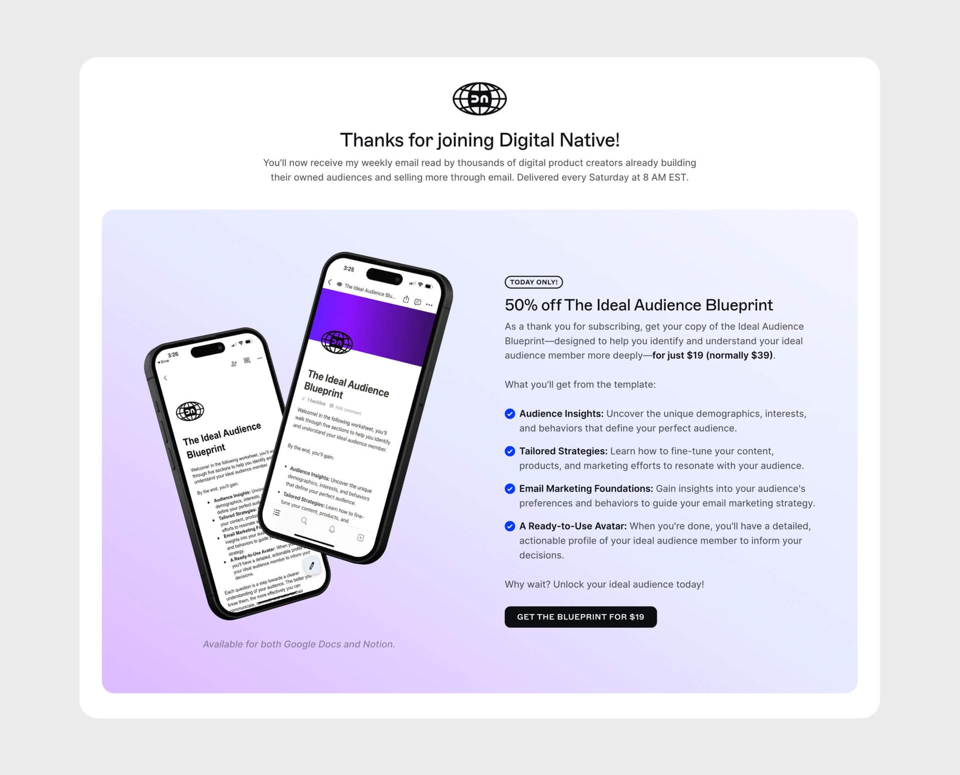
To show you that I eat my own dog food, I offer new subscribers a 50% discount on The Ideal Customer Blueprint on my Thank You page.
And I sell more of that product on my Thank You page than anywhere else on my site.

But what if you don't have a product or service to sell? That's fine. You can still use a CTA to start the relationship. Invite them to follow you on social media, join a Slack or Discord group, or check out previous issues of your newsletter.
Bonus tip: use long-form copy
If it fits your voice and brand, long-form copy on your Thank You page can go a long way for building a connection with subscribers and presenting your offerings. Just make sure you're balancing information with persuasion and keeping things readable.
Testing and optimizing your Thank You page
Having the right elements on your page is a great start, but the work doesn't stop there. You should be testing and optimizing different variations over time to see what actually works.
There are a few metrics worth tracking:
- Conversion rate: the percentage of visitors who take the action you want, like clicking through to your welcome email or buying your product. Higher is obviously better.
- Click-through rate (CTR): tracks the percentage of visitors who click a specific link or button. This tells you which parts of the page are engaging and which need work.
- Time on page: if people are bouncing off quickly, your content probably isn't connecting or the page is hard to navigate.
- Revenue per visitor: if you're selling something on the page, this tells you how well your offer and pricing strategy are working.
If you decide to test these (and you really should, especially if you're paying for traffic), keep a few things in mind. Test one element at a time, whether that's your headline, button color, or offer price. Isolating changes is the only way to know what actually moved the needle. Use a large enough sample size so your results are statistically meaningful. And give your tests enough time to run, at least one to two weeks, to account for fluctuations in traffic and behavior.
Make it work for you
Your Thank You page is one of the best opportunities you have to make a strong first impression. Remind subscribers about your lead magnet, set expectations, point them to your welcome email, and don't be afraid to sell something while they're excited.
When you pair a solid Thank You page with a good lead magnet and a well-crafted welcome sequence, it sells for you on autopilot. And who wouldn't want that?

Resources & Market Signals
Edition #120
Design Systems Meet AI, Process Evolves
Edition #144


